Blogs
28 March 2025
Reading Time: 3 mins
Blogs
28 March 2025
Reading Time: 3 mins
Nick Earle
Executive Chairman
LinkedInYou may have noticed that Eseye looks different. We are proud to unveil our rebrand—a bold step forward, perfectly timed with our strategic collaboration with AT&T that went live at MWC 2025.
This transformation is more than a new look; it’s a declaration of our ambition, innovation, and leadership in the IoT connectivity market. Our refreshed identity—including a dynamic new logo and an enhanced website—showcases our commitment to delivering cutting-edge eSIM orchestration and white-label solutions. While staying true to our heritage, we’re embracing a modern, progressive vision that sets us apart.
As Jeff Bezos once said, “Your brand is what people say about you when you’re not in the room.” With our new branding and positioning, we want to ensure that what they say about Eseye reflects our passion, expertise, and relentless drive to ‘Go Beyond’.
Our rebranding effort wasn’t merely about changing our visual identity. It was about encapsulating our core values, our vision, and our mission in a way that resonates with our clients, partners, and the industry at large. With this rebrand, we aim to communicate our dedication to providing seamless, reliable, and innovative IoT solutions.
David Langton, our Chief Marketing Officer, has been instrumental in this journey. “We are not just changing our logo or our colours,” he commented. “We are redefining how we connect with the world and how the world connects with us.”
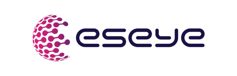
Our new logo and visual identity are designed to be bold, modern, and dynamic, reflecting the forward-thinking nature of our company. Central to our new visual identity are the helix and orb elements. The helix represents the continuous evolution and innovation of our technology, symbolizing growth and progress. The orb, on the other hand, signifies our global reach and connectivity, highlighting our commitment to bridging gaps and connecting the world through our IoT solutions.
The logo’s sleek lines and vibrant colours embody our dedication to excellence and cutting-edge technology. The enhanced website offers a more intuitive user experience, making it easier for our clients and partners to access information and services.
Our new visual identity is not just about aesthetics; it’s about creating a brand that is instantly recognizable and that stands for quality, reliability, and cutting-edge technology.
As we embark on this new chapter, we are more committed than ever to our mission of revolutionizing IoT connectivity. Our rebrand is a testament to our growth, our resilience, and our unwavering dedication to our clients. We are excited about the future and the endless possibilities that lie ahead!
And this rebrand is just the beginning. We have ambitious plans for the future, and we are confident that our new identity will take us to new heights. Together, we will continue to go beyond.
Nick Earle
Executive Chairman
LinkedInNick is the Executive Chairman at Eseye and believes in connectivity that ‘just works’; that makes people’s lives and jobs easier; connectivity that’s invisible. He’s a visionary business leader with a distinguished career in technology spanning more than 30 years, spanning large corporations and dynamic start-ups and oscillating between start-ups and global IT, tech and transportation companies.
Previously, Nick led organisations and cross-company transformation programs for two $50B global corporations; Cisco where he ran the Cloud and Managed Services business as well as their Worldwide Field Services function, and Hewlett Packard where he ran the global Enterprise Marketing function and the internet transformation strategy.
Predictable performance is the key to IoT success. Let our experts test your device for free. Receive a free trial IoT SIM trial kit and speed up your IoT deployment with expert insights and seamless connectivity.